Visual Power: Slide Designes That Support Your Message
You know that feeling: when a speaker’s slides are so cluttered or hard to look at, you just can’t tune into their speech? Maybe there was too much text, a dizzying background, or pictures that had nothing to do with the talk. This is a classic case of visuals distracting from the message, rather than supporting it. In a conference, a meeting, or even a class presentation, your slides should be your best friend, not your enemy!
Effective visuals are crucial for any speech. They help your audience understand complex ideas, remember key points, and stay engaged throughout your entire presentation. They are a vital part of your planner for any presentation. When designed correctly, visuals make your talk more impactful. When designed poorly, they can completely derail it.
Why Visuals Matter (When Done Right!)
Think of your visuals as a powerful sidekick to your speech. They don’t replace you, but they make you stronger.

The importance of visuals:
- Understanding: Complex data, like charts or graphs, is much easier to grasp visually than just hearing numbers.
- Memory: People remember pictures and stories far better than plain text or spoken words. A strong visual helps your audience recall your core message long after your duration is over.
- Engagement: Good visuals keep eyes on the screen (and then back on you!), breaking up the monotony of just listening.
- Credibility: Professional-looking PPT slides show you’ve put effort into your presentation.
The Golden Rule: Support, Don’t Compete!
This is the most important rule for any visual aid: Your visuals are there to support what you are saying, not to be what you are saying. You are the star, not your PowerPoint or PDF. If your audience is busy reading every word on your slide, they’re not listening to you. That’s a huge problem for your talk!
Key Principles for Effective Slide Design
Let’s break down how to create visuals that truly work for you.

- 1. Keep it Simple: One Idea Per Slide * The Problem: Many people try to put their entire script onto one image. This results in tiny text, too many bullet points, and an overwhelmed audience. * The Solution: Each slide should convey one main idea. If you have five points, use five slides! This keeps your visuals clean and focused. * Slide Coach Tip: As you build your PPT slideshow, if you find a slide crammed with text, that’s a signal to break it into multiple slides. Our calculator helps you manage the duration of these additional slides.
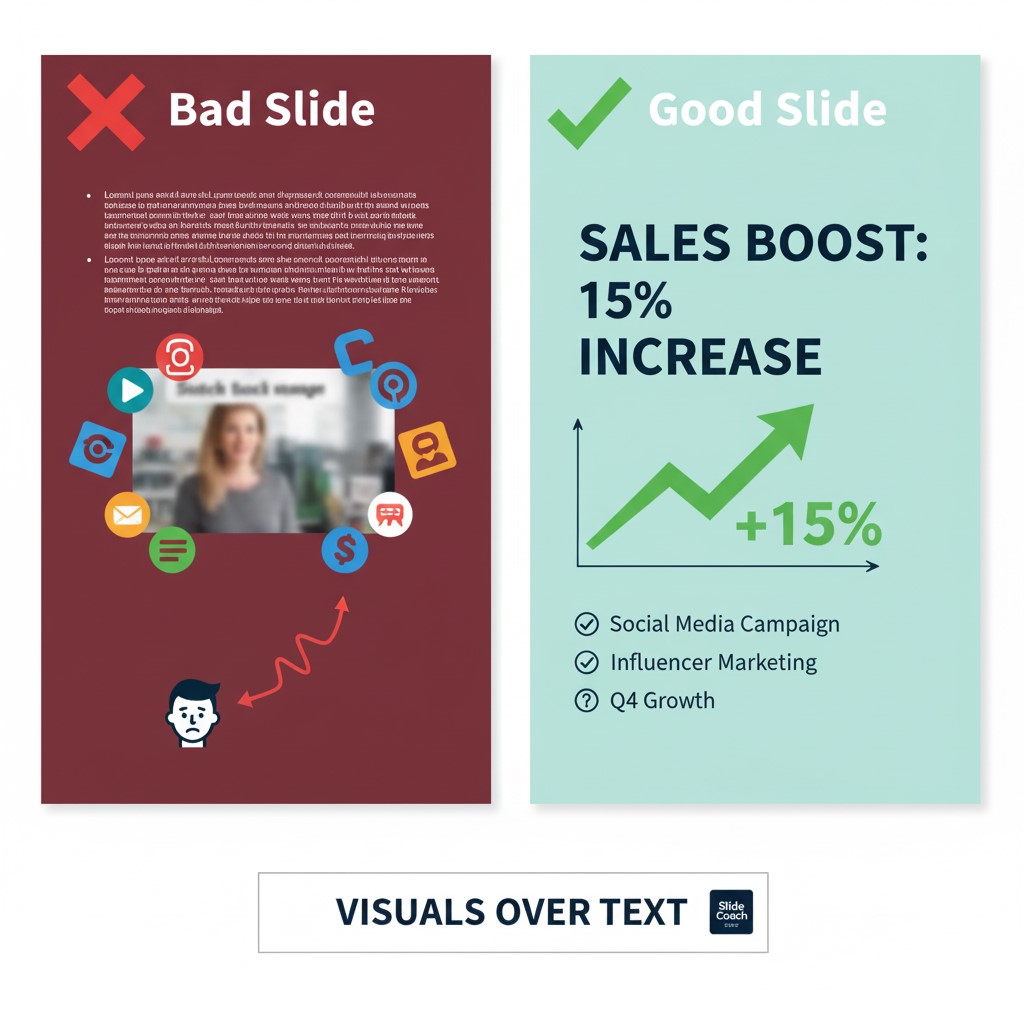
- 2. Visuals Over Text (Mostly!) * The Problem: Speakers often fill slides with bullet points and paragraphs, essentially turning them into digital notes. * The Solution: Whenever possible, use an image, a graph, or an icon instead of text. If you must use text, keep it to a minimum (e.g., a short headline, 3-5 bullet points, no more than 6 words per point). * Example: Instead of a bullet point saying “Sales increased by 15% due to new marketing efforts,” show a clear bar graph with a “15% increase” label..
Choose High-Quality, Relevant Images:
The Problem: Blurry, pixelated, or generic stock photos that don’t add anything to your speech.
* The Solution: Use professional, high-resolution images that directly relate to your message. Visuals should evoke emotion or illustrate a point instantly. * SlideCoach Tip: Consider using the “visual time” feature in our calculator. If you have a powerful image you want your audience to fully absorb, allocate an extra 10-20 seconds on that slide to let the visual sink in while you explain it.
4. Consistency is Key: * The Problem: Every slide looks different – different fonts, colors, and layouts. This makes your presentation look messy and unprofessional. * The Solution: Stick to a consistent design theme. Use 1-2 easy-to-read fonts (like Arial or Calibri), a consistent color palette that matches your brand or topic, and a uniform layout for similar types of content.
5. Readability from a Distance: * The Problem: Text that’s too small for people in the back of the room to read. * The Solution: Use large font sizes (e.g., minimum 24-30pt for body text). Ensure there’s enough contrast between your text color and background color (e.g., dark text on a light background).
Time Management for Your Visuals with SlideCoach
Creating effective visuals also ties directly into time management for your presentation. Each frame needs its moment in the spotlight, but you can’t linger too long.
Practice with Visuals: During your practice, click through your presentation as you speak. Does each screen appear when you’re talking about its content? Are you speaking too fast over a detailed image? This kind of rehearsal, guided by our calculator, will perfect your flow.
Slide Count vs. Duration: When you add more visuals (by breaking down dense ones), you might think you’re making your talk longer. However, if each new slide is simpler and clearer, you might actually be able to cover the information more efficiently.
The Slide Coach Planner: Upload your finished PowerPoint or PDF to Slide Coach. Our presentation time calculator will show you your overall duration. If you’ve used powerful visuals that require explanation, remember to use the “visual time” feature for specific information screen. This ensures you don’t rush through important graphs or images that need a moment for your audience to process.
Conclusion: Your Visuals, Your Advantage
In a world full of generic PPT slideshows, using visuals effectively can make your presentation stand out. It transforms your talk from a mere information dump into a memorable experience for your audience, whether it’s a critical conference or a daily meeting. Remember the golden rule: your visuals are there to support your message, not to become the message itself.
By following these principles and leveraging the time management ppt capabilities of Slide Coach, you’ll design supporting visuals that captivate, clarify, and contribute to a truly successful speech.
Frequently Asked Questions for “Using Visuals Effectively”
What is the golden rule for using visuals in a presentation?
The golden rule is: Your visuals are there to support what you are saying, not to be what you are saying. The visuals in your PowerPoint or PDF should enhance your spoken message, clarify complex points, and engage the audience, rather than acting as a script for you or a distraction for them during your talk.
How can I avoid putting too much text on my PowerPoint screens?
The best way to avoid text-heavy slides is to adopt the “one idea per slide” principle. Focus on using visuals (images, charts, icons) whenever possible, and if text is necessary, keep it minimal-think short headlines, 3-5 concise bullet points, and no more than 6 words per point. This improves readability and time management for your audience.
Why is it important to use high-quality images and maintain consistency in my PPT slideshow?
High-quality, relevant images instantly convey professionalism and make your presentation more engaging and memorable. Consistency in design (fonts, colors, layout) across all your visuals prevents visual chaos, making your talk appear polished and well-planned. Both aspects significantly boost your credibility in a conference or meeting.
How can the SlideCoach.app help me manage the duration of my presentation when I’m using many visuals?
SlideCoach is an excellent planner for time management ppt presentations. When you upload your PowerPoint or PDF to our calculator, you can use the “visual time” feature. This allows you to allocate extra seconds for display items containing complex charts or powerful images that require more audience processing time, ensuring you don’t rush important visuals and stay within your overall duration.
Should my visuals be able to stand alone without my speech?
Generally, no. While your slides should be clear and visually appealing, they are a complement to your spoken talk. If your slides can perfectly convey your entire message without you, then you might be putting too much information on them, turning them into a distraction. Aim for visuals that prompt understanding and provide context, leaving the detailed explanation for your verbal presentation.